Parchment Web Frills
Posted Mon, 09/26/11
I've been scouting for a new design for my official web site for some time. It's not something I spend hours doing, but once in a blue moon a design will catch my eye. Typically, the templates come from open source locales. I'll test a design that attracts my attention. Nine times out of ten, it won't work for me. However, this time I think I've hit the mark right on.
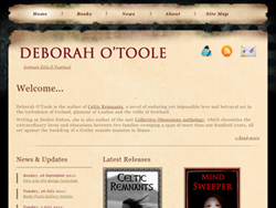
Here's a screenshot of the main page:
A longtime fan of Gothic and Celtic design with hints of medieval thrown into the mix, the old "parchment paper" feel of the new site best suits my own tastes. Hopefully, everyone who visits will agree.
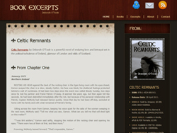
This is a screenshot of the design for all book excerpts at the site:
Both templates are based on designs from Templatemo, an open source site with a wide variety of freebies. Colors, layout and other details were changed according to my taste, but I think the general gothic feel comes across loud and clear.
Welcome to my new web world!
Tags: Web Design/Computer Misc

